How to choose imagery for a SaaS landing page
Most landing page image problems are really sequencing problems. Someone writes the copy, builds the layout, and then goes looking for pictures to fill the holes - at which point every image is chosen by keyword, in isolation, under deadline. The result is a page where nothing clashes badly enough to name but nothing belongs together either.
The fix is to decide what the page's imagery is for, section by section, before you look at a single photo.
What each part of the page is actually doing
| Section | What the image is for | What to use |
|---|---|---|
| Hero | Set the emotional register in under a second, before anyone reads a feature | One atmospheric photograph carrying the headline. Not a UI screenshot at full width. |
| Product demo | Show the thing working | A clean interface capture, cropped tight to the one thing you are proving. This is where screenshots belong. |
| Section breaks | Give the eye somewhere to rest between blocks of text; keep scroll momentum | Photographs from the same world as the hero - texture, environment, a hand mid-task. |
| Social proof | Make testimonials feel like they came from people | Environment or workspace shots. Avoid stock portraits standing in for real customers. |
| Final CTA | Close on feeling, not information | The quietest, most confident image you have. Often the best frame in the set. |
Notice how few of those slots want a screenshot. Interface captures are evidence, and evidence is persuasive only after someone cares. Photography is what makes them care.
The rule: atmosphere over explanation
The instinct with software is to show the software. But a visitor who does not yet understand the promise cannot parse a dashboard - they see a busy rectangle and scroll. What moves them is the register of the thing: is this careful or fast, calm or intense, for a solo builder at 2am or a team in a bright office?
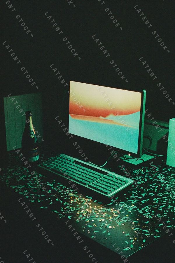
That register is exactly what a photograph carries and a screenshot cannot. So pick images for the world your product lives in, not for its feature list. A deployment tool can be late nights and machine light. A scheduling product can be a cleared morning. Neither of those images contains the product, and both of them sell it.
Choose the look before the images
Before you gather anything, write down four decisions: the light, the texture, the palette, and the mood. Every candidate image either fits that spec or it is out, no matter how good it is on its own. This is the single highest-leverage habit in landing page design, and it is why matched sets exist - the whole point is that the decision has been made once, consistently, across every frame.
If you are generating your own imagery, the same discipline applies with more effort: freeze a style spec, vary only the subject, and reject hard. We wrote that method up in full: how to get a consistent style out of AI image tools.
Five mistakes that make a page look templated
- The keyword hero. An image chosen because it matched a search term ("team collaboration") rather than because it means something for your product. Visitors have seen it on forty other sites this month.
- Screenshot-as-hero. Full-width UI above the fold, before the promise. Move it one section down and watch the page breathe.
- Mixed illustration and photography. Both work; both together, without a system tying them, reads as two different companies. If you use both, decide the rule (illustration for concepts, photography for atmosphere) and hold it.
- Cast enthusiasm. Stock portraits of people delighted by nothing. If a human presence is not doing real work in the frame, an empty room with good light beats it.
- Too many images. Nine photos on a landing page means none of them is load-bearing. Cut to the ones that would be missed.
A pre-publish check
Before you ship the page, do this: shrink the browser until the text is unreadable and scroll from top to bottom. You are now seeing what a visitor sees in the first two seconds - shapes, color, and rhythm.
- Do the images look like they come from the same place? If any one jumps out as a different color temperature, it is the problem.
- Is there a clear visual pause between text blocks, or does the page read as one grey wall?
- Does the closing image feel like a conclusion, or did the page just stop?
- Could you delete any image and lose nothing? Delete it.
The same discipline that makes a set of photographs cohere is what makes a page cohere. If you want to see the effect at full strength, your first three downloads are free - pull three frames from one studio, drop them into a page, and the difference from keyword-matched stock is immediate.
FAQ
What images should a SaaS landing page use if the product is just software?
Imagery that carries the mood of the outcome, not the mechanics of the product. One atmospheric hero, two or three supporting photographs where text would otherwise pile up, and clean interface captures only where you are demonstrating something specific.
Should the hero image be a screenshot of the product?
Usually not on its own - it asks people to read a UI before they know why they should care. Lead with atmosphere, show the interface one section down.
How many images does a landing page need?
Three to six photographs is typical: a hero, a few section breaks, and a closer. Every extra image dilutes the rest.
Why do stock photos make a landing page look cheap?
Because keyword-matched images have no shared point of view - different light, different color casts, different decades of art direction. Visitors read the incoherence as low effort even when they cannot name it.
Should landing page images show people?
Only where a human presence does real work. Hands, backs, and people mid-task read as observed; staged enthusiasm reads as cast.
Imagery for people who have nothing to photograph.
That is the whole business here: matched editorial sets for software, services, and newsletters. Take three downloads free - any three frames in the library - or browse all 41 sets.