A field guide to stock photo cliches: six photos you have seen 10,000 times
Every one of the images below was generated in-house as a deliberate parody. We shot the cliche as faithfully as we could, because you cannot avoid a trap you have not looked at closely. Here is the field guide.
1. The Handshake

The handshake is supposed to mean trust. What it communicates is that no one involved could think of anything specific to say about the deal. If your partnership matters, show the thing you built together, the place where it happened, or nothing at all - a good headline beats a stranger's knuckles.
2. The Salad Laugh
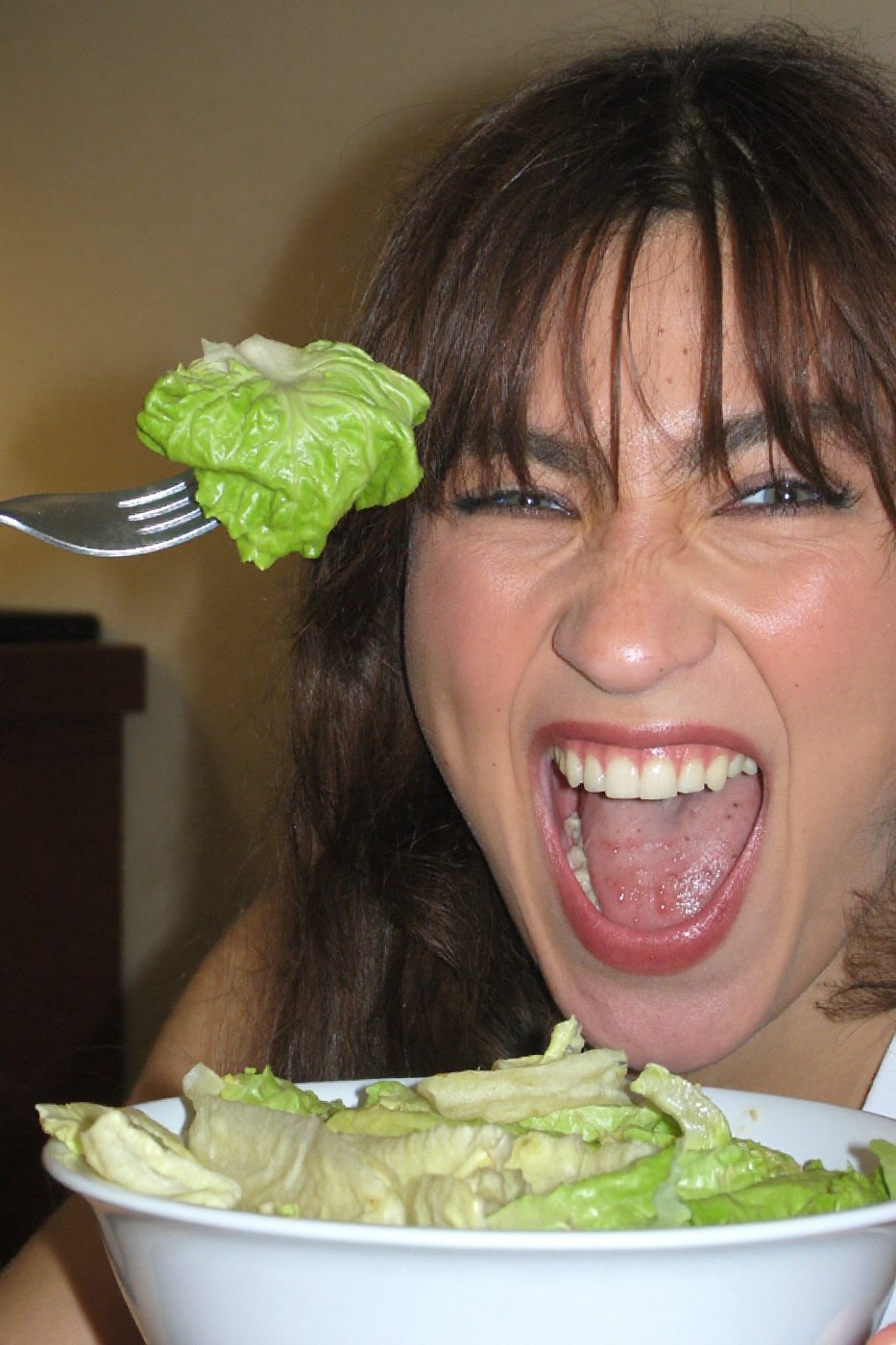
Nobody laughs at salad. The photo exists because "healthy" plus "happy" was a search query, and a model was paid to weld the two together at maximum intensity. Emotion in imagery works when it is slightly under-played - a person mid-thought over lunch is believable, a person howling at romaine is an alarm bell.
3. The Blank Whiteboard
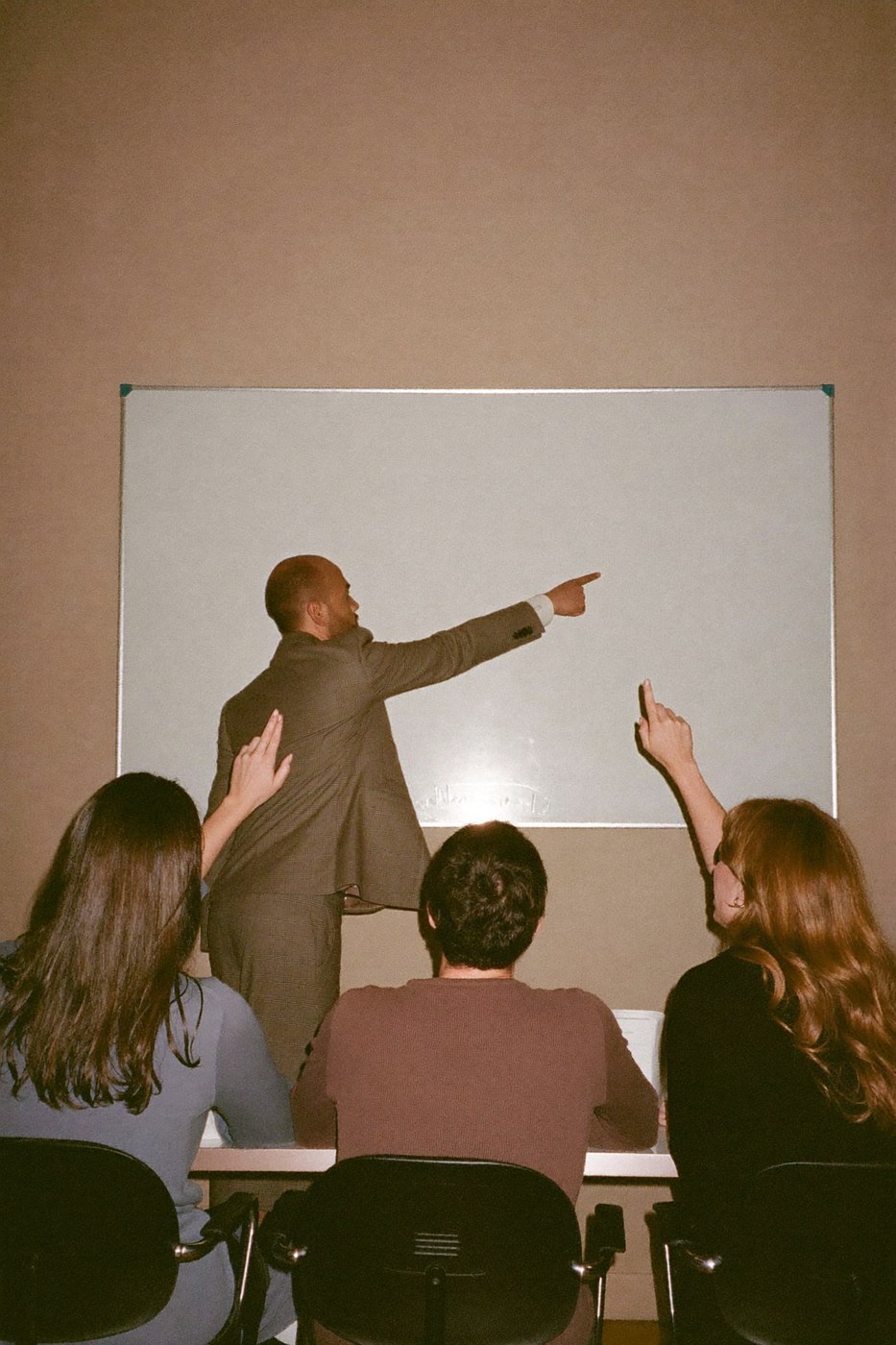
The blank whiteboard is the perfect corporate image: it signals "strategy" while committing to no strategy whatsoever. The colleagues nod at nothing. If you need a workshop image, the credible version is the aftermath - a messy desk, a wall of notes too small to read, coffee cups at the end of a long session. Specificity is what makes a scene feel real, even when the details stay out of focus.
4. The Headset Smile
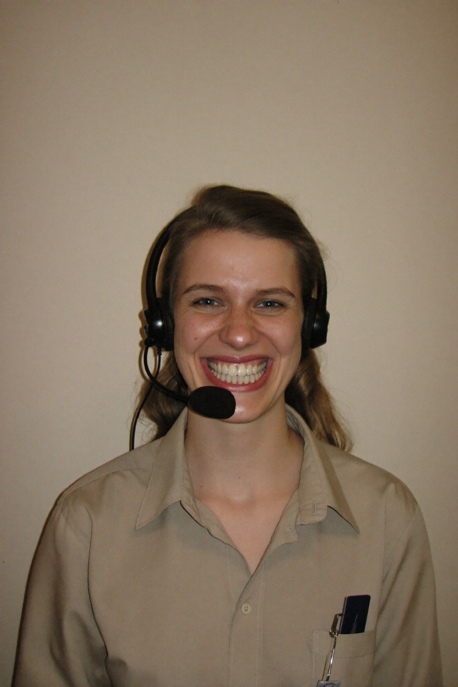
The headset smile is meant to say "we are here for you," and instead says "this person is performing warmth under fluorescent lighting." Support pages generally do better with no humans at all than with a fake one - response times, a real name in the reply, and a decent illustration will beat the laminated smile every time.
5. The Triumphant Jump

Success, as a stock concept, is a person achieving liftoff while destroying documents. Real success photographs badly, which is exactly why this cliche exists - the moment a metric ticks over looks like someone squinting at a laptop. If you want celebratory imagery, shoot the texture of it: the confetti on the keyboard the morning after, the empty pizza boxes. Aftermath is more evocative than apex.
6. The Solemn Fist Bump
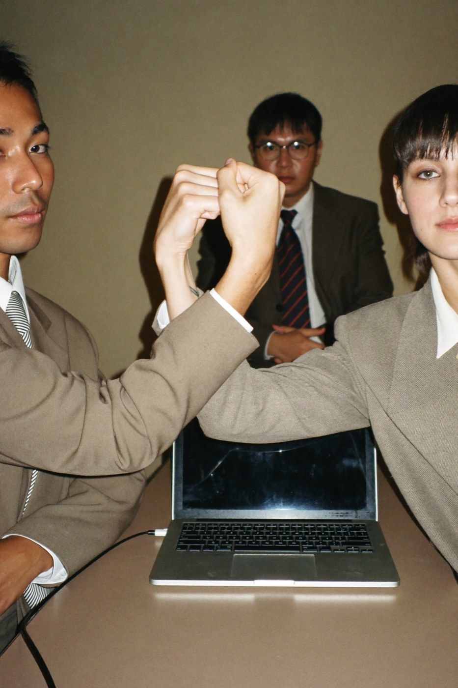
The fist bump wants the emotional register of teamwork without any actual team or any actual work. Note the witness in the background, present to certify the bump. This image is what happens when "collaboration" is treated as a visual ingredient you can add, like salt.
Why these keep getting used
They are cheap, they are safe, and they match a search term. That is the whole mechanism. Cliches are what you get when imagery is chosen by keyword instead of by point of view - each individual choice is defensible, and the sum is a website that looks like every other website.
The tell is consistency, or the lack of it. A page assembled from keyword-matched stock has five images with five different lighting setups, five different color casts, five different decades of art direction. Even a viewer who could not articulate one of these problems feels the incoherence instantly.
What to use instead
Pick a look before you pick images. Decide on the light, the grain, the palette, and the mood, and then only accept images that fit it - one rejected handshake at a time. This is the same discipline whether your images come from a photographer, an archive, or a generator. We wrote up the full method here: how to get a consistent style out of AI image tools.
See the opposite of a cliche.
We publish matched editorial sets - same light, same grain, same palette across every frame. Take three downloads free - pull them from one studio - or browse all 41 sets.